One of the pillars of user experience is the :hover state; yet, most designers do not consider this state when planning designs. Another important state is :focus: without this specific state, many users would find it practically impossible to navigate in a website. Since user experience should be at the very core of any website design, we should be planning for UX issues upstream of development.
Link up!
While links are made up of text, they should never look like text. If users cannot immediately pick out the links on a page, the link style is a problem and should be addressed. When choosing link color, it is important to pick a color with enough contrast for the majority of users. One good tool to help developers stay in compliance with WCAG 2.0 standards is a color accessibility app called Contrast.
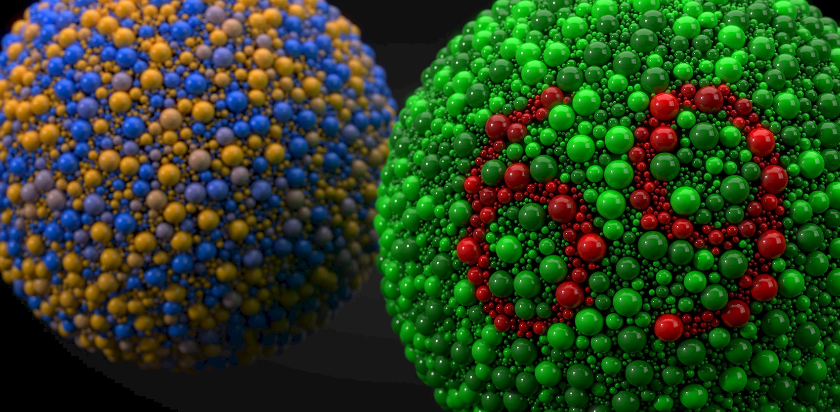
Link colors are more apparent to normal user.
Link colors are more apparent to normal user.
Link colors are less apparent to colorblind user.
Link colors are less apparent to colorblind user.
In the first two examples, the links have a high contrast, while the others have a very low contrast.
Stay focused!
While most browsers have their own default state, it is frequently disabled due to inconsistencies across browsers. This leaves users who navigate with their keyboards in the dark, with no ability to move around the site. You should never disable a default :focus state unless you have a carefully-planned replacement that is:
- easy to spot,
- not reliant on color alone,
- consistent across all button styles.
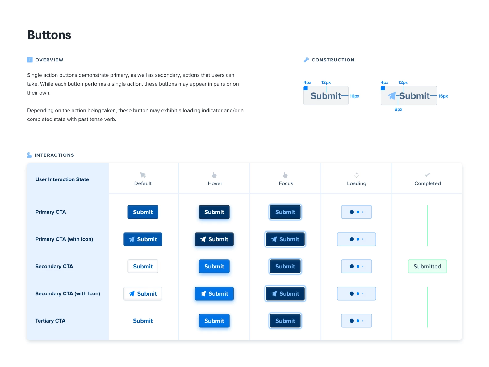
One surefire way to visualize and plan your links and input control states is to use a style guide. Generally, a style guide defines fonts and text sizes used across the site, as well as the overall styles used for links, buttons, menus and other input controls. The image below is a good example of a style guide outlining the states of the design. A style guide provides your development team with a global reference tool and minimizes pointless back-and-forth due to inconsistent design.

Example of style guide for call-to-action buttons by designer Max Burnside.

