
Complex UI Does not Mean Complicated…

“Intuitive, simple and easy to use” are the words that automatically come to mind each time we think or talk about desktop software or mobile applications user interfaces (UI).The simplicity and easiness of the UI, which is used daily by the general public, are without a doubt the major reasons behind the UI’s appeal and success.
“Intuitive, simple and easy to use” are the words that automatically come to mind each time we think or talk about desktop software or mobile applications user interfaces (UI).
The simplicity and easiness of the UI, which is used daily by the general public, are without a doubt the major reasons behind the UI’s appeal and success.
These intuitive user interfaces are greatly appreciated to quickly carry out frequent and simple operations… Think about banking machines (ATM), automated parking payments kiosks or your car’s GPS.
However, there is a little detail we sometimes neglect when voting for the simplicity and easiness of a user interface: the general public factor. When we are accustomed to operating these minimal user interfaces daily, we rarely think about the other side of the coin, and that is the industrial and professional software and their UI.
In fact, industrial software UI can be complex, but, as this type of software is usually out of the general public’s reach or interest, we rarely hear designers talk about it or discuss how it is developed.
Certainly, software such as CAD programs destined for engineering, or applications driving high tech industrial machines might look complicated to anyone who is not familiar with the field that the software serves. However, if a complex software UI is well designed, professionals in that specific field will certainly have a global understanding of its functionality when they see it for the first time.
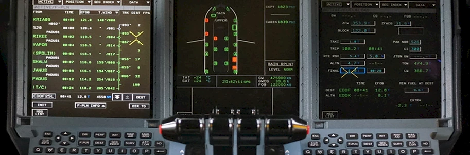
Let’s take the aviation field for example: cockpits in modern airliners are now almost entirely digital. All the visual or textual content pilots need to have visible at the same time during every phase of a flight are represented with moving shapes, colors, codes and textual information, appearing on the few small digital displays in front of them. Not to mention the various alerts and warnings or even the simple recommendations and heads-ups that need to appear here and there on the screens…
For common passengers taking a glimpse at the airliner cockpit when boarding, what they see on the screens might seem like a jungle of colorful shapes and obscure data… They see this as science fiction. The cockpit complexity gives these people the impression that the information displayed is almost impossible to understand or use.
However, this is not the case for those in the aviation field even if they are not an airline pilot or used to this specific airliner model. Despite the complexity of the UI, these individuals can still recognize most of the important information on the screens and understand its general purpose.
Clearly, in the case of the airliners’ cockpit designs, more expertise than just UI or UX designs is involved. Yet, based on this example, we see that the word “complex” in a UI needs to be distinguished from the word “complicated”.
This is why a designer who aims to simplify a complex UI destined for industrial or professional use will not necessarily apply the best user interface design practices for that purpose.
Thus, for this type of complex software, we do not apply the UI design philosophy usually reserved for general public applications.
In order to preserve the integral functionality of complex software, a UI designer must not (or is not allowed to) throw away or hide features and information or push them deep into the application for the sake of simplifying its usability. This could most probably lead to an unusable software or machine. In some cases, not having all the information and features visible at once might affect – among other factors – the operation’s efficiency or safety.
In fact, the design strategy behind such a complex UI conception could be basic and simple. Since designers can’t simplify, then they must aim for clarity in complexity. The basic rule to apply is to find the best strategies to organize the dense content. We can consider grouping the similar features and information to create multiple bundles or sectors on the screen. Attention must also be paid to the structure or hierarchy of these groups and to the hierarchy of the items within each group. The use of color is important only when color displays are involved and when the health of the user's eyesight is not a factor to consider. However, colors are thought of as codes and not as embellishment. They must also be carefully analyzed and objectively chosen. For instance, alerts and warnings must not only be clearly distinguished from regular information but must quickly detach from the UI and catch the user’s eye.
We also know that although these industrial and professional UI are thoroughly thought out and very well designed, they still require proper user training and certification. Also, unlike general public application designs, the conception process requires multiple levels of usability (user and environment) studies, many levels of analysis and tests coupled with numerous functional prototypes.
All in all, professional and industrial software with massive amount of important information and functionalities that need to be displayed more or less at once, must be thought out differently in terms of design compared to light duty general public applications. A UI designer must know and accept the fact that the complexity of the software is a usability factor and a reality to deal with. It is certainly not a flaw or a problem. Thus, when designing and developing these types of UI, designers must pay careful attention to avoid turning complex into complicated…