Flexbox CSS3

Just a few years ago, most Web site layouts were based on tables. This method had several disadvantages:
- The underlying code was heavy and unreadable. Even for the simplest sites, you had to embed several tables.
- There were problems with standards and semantics: tables excel at presenting data in tabular form, not at creating page layout.
- There were problems with adaptive design: tables do not easily accommodate a variety of screen sizes.
Cascading Style Sheets (CSS) introduced “boxes” and the “float” and “clear” properties. There are several types of classic boxes: “block”, “inline” and “inline-block”. But even these boxes have their limitations:
- While it is possible to align several boxes with “inline-block”, items are automatically separated by blank spaces.
- Items can’t be centred vertically.
- The order of the items cannot be set within a container.
To overcome these limitations, CSS3 has introduced a new kind of box: Flexbox.
Flexbox provides a more efficient way of organizing and aligning boxes, and of distributing the spaces between items within a container even when their dimensions are unkown and the display size is unkown.
Basic Concepts
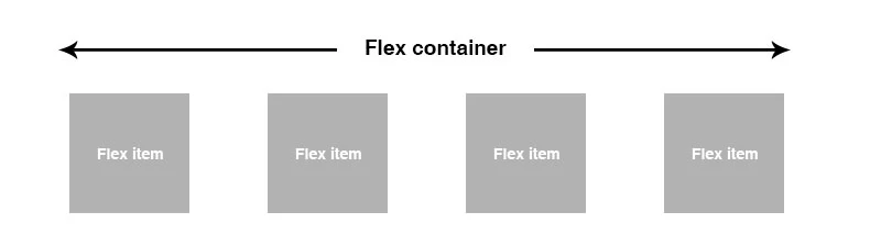
FlexBoxes are considered parent containers, called “flex containers”. Their direct children in effect become “flex items”, free of CSS declaration.
Parent Properties
display : flex | inline-flex.
This property can have a flex or inline-flex value. It defines flexible containers, whose direct children are considered flex items.
.container {
    display: flex;
}
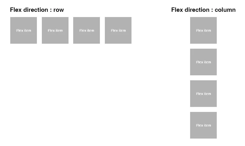
flex-direction: row | row-reverse | column | column-reverse.
row: (default value) from left to right,
row-reverse: from right to left,
column: from top to bottom,
column-reverse: from bottom to top.
flex-wrap: nowrap | wrap | wrap-reverse.
By default, flexible items are presented on a single line. This can be changed with the flex-wrap property.
flex-flow:
This property is a shortcut for the flex-direction and flex-wrap properties, the default value being “row-nowrap”.
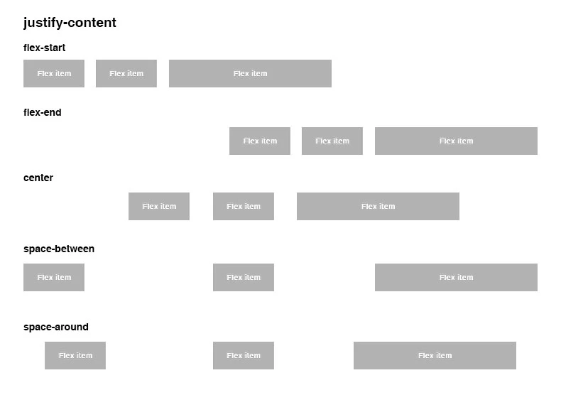
justify-content: flex-start | flex-end | center | space-between | space-around.
This property allows you to organize items around a central axis.
align-items: flex-start | flex-end | center | baseline | stretch.
This property allows you to organize items around a horizontal axis.
align-content: flex-start | flex-end | center | space-between | space-around | stretch.
This property allows you to line up items within a container.
Child Properties
order : whole number.
By default, items are organized on a first come basis.
flex-grow:
This property defines an item’s potential to grow.
flex-shrink:
This property defines an item’s potential to shrink.
flex-basis:
This property defines an item’s default size.
flex: none | [ <'flex-grow'> <'flex-shrink'>? || <'flex-basis'> ].
CThis property is a shortcut for flex-grow, flex-shrink and flex-basis.
Conclusion
Flexbox solves most layout problems, but its implementation remains a problem in some browsers, even though most Flexbox properties are supported by later browser versions. All in all, Flexbox is definitely worth a look.