Insights and Technology
Our story, vision and perspectives on technology, design and business solutions.
Featured Articles

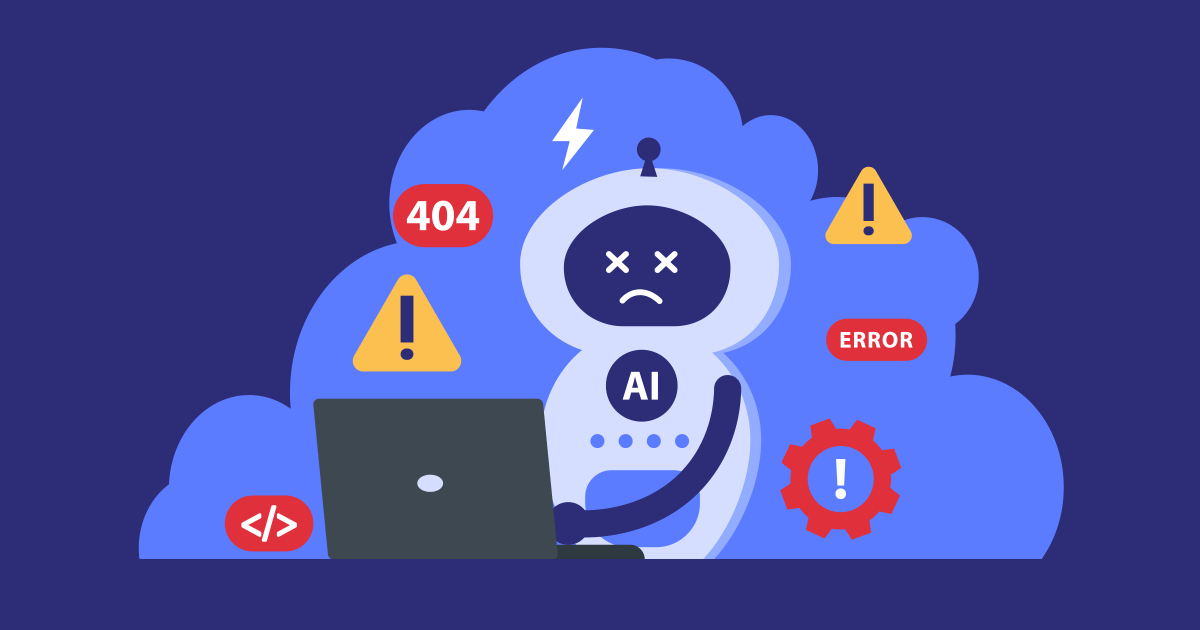
Artificial intelligence (AI) promises a lot, but it's true potential often remains untapped.
Why? Well, not because technology lacks maturity, but because we forget that real-world use by people remains the real driving force behind any digital transformation.
And yes, no one understands humans better than humans.
This is where the “human-first” approach comes in, a simple philosophy that places people at the heart of technological changes, and thus designing tools and systems that genuinely work for the individuals who use them.
The goal isn’t to strengthen the technology itself. It’s to strengthen our understanding of the work your teams do before adding a layer of artificial intelligence on top of it. You can have the most advanced systems in the world, but if your teams aren’t ready, nothing will move forward.
At Spiria, we see it every day. Successful organizations don’t just modernize their infrastructure. They modernize how their teams interact with their tools, their data, and their workflows. They lay the groundwork for AI to become useful, understandable, and sustainable.
This article explores how human-centred software modernization naturally prepares organizations to welcome AI that integrates itself smoothly, supports people, and enhances their work for long-term AI success.
Modernizing for AI starts with modernizing for humans
Modernizing first, then wondering how to drive AI adoption internally.
How many organizations have made this mistake?
The desire to integrate AI is natural. It represents progress, innovation, and efficiency. But in reality, it often struggles to fit into environments that were never designed to support how teams actually interact with them.
The result? These systems that seem modern on paper remain underused. The teams using them are frustrated, and bypass these new tools to return to old habits. It’s a disappointing ROI that leads leadership to question AI itself.
In our previous article, “Why Legacy Systems Break Under AI Pressure”, we explored the technical obstacles of fragmented data, rigid architectures, and technical debt. But these technical obstacles are only part of the problem. The other part, the one we overlook far too often, lies in human and organizational silos.
That’s why a people-centered approach is essential. Modernization must be guided, not only by technical requirements, but by the people who depend on these systems every day. It’s about clarifying, simplifying, and streamlining the experience, so tools become coherent, easy to use, and aligned with day-to-day work.
AI only creates value when it enters an environment teams already understand. Modernizing for AI therefore means modernizing for humans first.
The three foundations of human-readiness: clarity, trust, collaboration
Before diving any further, let's remember one key thing, “human-first” is the approach, while “human-ready” is the outcome. In other words, an organization reaches this state when modernization is intentionally designed for people and put into practice.
These pillars are the foundation for this:
1. Clarity
Clarity translates to making systems readable, workflows understandable, and tools intuitive.
It is about operational transparency, not technical transparency. What data does AI use? Why does it recommend one action over another? What are its limits?
Teams need to understand what a system does, how it does it, and why it does it.
Clarity reduces uncertainty and opens the door to natural, confident use of AI.
It helps users know when to trust the algorithm and when their own judgment should take the lead.
2. Trust
Trust is the invisible core of any technological adoption.
It grows gradually, but it starts with evidence.
Building trust in AI requires reliable systems, consistent results, and tangible improvements in day-to-day work. People need to see that AI simplifies their work rather than complicates it, and that it respects operational realities instead of ignoring them.
Ongoing training is crucial. Not only at the beginning of a project, but over time, giving teams the space to explore, ask questions, and build technological intuition.
When trust settles in, AI becomes genuinely useful.
3. Collaboration
Collaboration is what brings everything else to life.
AI projects rarely fail because of algorithms. They failed because people weren’t involved early enough.
Preparing teams to collaborate with AI means understanding their real pain points, their critical decisions, and their operational constraints. This knowledge is what allows AI to find its appropriate role in the workflow.
AI can optimize a process, but only humans can understand nuance, context, and intent. This complementarity is where its true value lies.
From AI-ready to human-ready: two concepts often confused
Many organizations aim to become “AI-ready" with upgraded infrastructure, centralized data, and new intelligent tools. But none of these matter if people aren’t ready to use them.
Being “human-ready” is different. It is the outcome of a “human-first” approach. It means having simple systems, clarified processes, and tools that match real-world usage. It means creating an environment where teams understand the technology, trust it, and can apply it with discernment. And this people preparation must come first.
Too many organizations treat modernization as an isolated IT initiative. They invest millions in new infrastructures without ever questioning user experience. But what is the point of a high-performance system if no one wants to use it?
Organizations that succeed with AI don’t just deploy new tools. They prepare their teams to integrate them into daily practices, even before the first deployment.
They adjust processes early. They clarify roles and responsibilities before AI arrives. They build trust during the design phase, and do not wait for the first setbacks.
They invest in sustainable organizational transformation, where humans remain at the centre of decision-making from day one.
What if the key to AI success was simply people?
“Human-first” modernization isn’t a trend.
It’s a working philosophy based on a simple truth: long-term performance is built on strong human foundations, not solely on advanced algorithms.
Modernizing means creating systems that are clearer, more reliable, and more people-centered, systems capable of evolving at the pace of the people and organizations they support.
At Spiria, this belief guides our approach to modernization and AI integration projects. We enable organizations to build custom solutions that empower people, so AI can truly deliver on its promises.
Because the foundation of AI success lies in an approach that makes artificial intelligence useful, sustainable, and deeply human.
What if the best way to succeed with AI was simply to put people back at the heart of modernization?
Today, Artificial Intelligence (AI) dominates every strategic and business growth conversation. So far, this is probably old news to you.
But once we move past theory, the reality is quite different. While budgets allocated to AI projects are exploding, many organizations encounter a major obstacle they hadn’t fully anticipated: their legacy systems are slowing down their digital transformation.
Does this reflect the reality of your company?
Here, the real obstacle isn’t even AI’s complexity. It’s the growing gaps in your systems. They were never designed for today’s standards and lack three crucial elements: clean and reliable data, flexible integration capabilities, and computing power.
Recognizing these limitations makes it clear why application modernization has shifted from a technical decision to strategic one.
1. Clean Data: AI’s Fuel
Would your data be ready to feed AI today? If your immediate thought was anything close to “yes, absolutely” ... well, this tab would (probably) be closed already.
AI’s efficiency relies entirely on its access to clean, structured, and consistently formatted data. To generate reliable analyses, machine learning algorithms require absolute accuracy in their data sources. Even slight data quality issues can quickly degrade the performance of the entire intelligent system.
However, for legacy systems, the information stored is messy and inconsistent. It is kept in incompatible formats, and lacks the governance required to ensure long-term data integrity. The result? Your data lives in silos, often in contradictory formats, which is exactly the opposite of what AI needs.
These analytical deficiencies create a massive roadblock for organizations looking to leverage their data as a true strategic asset.
Sounds familiar? Well, it clearly indicates that your existing infrastructure is limiting your ability to stay competitive.
The consequences are immediate: while you struggle with inconsistent information, competitors are already harnessing predictive analytics and intelligent automation. This gap in data maturity rapidly translates into a competitive disadvantage.
Data architecture modernization eliminates these quality issues by providing automated governance systems, real-time validation pipelines, and consistent structuring that transform your information into resources immediately usable by AI.
2. Flexible Integrations: The Unified Ecosystem
How much time do you spend on custom integrations? If you have to think about it, it’s already too much.
AI requires a complete, unified view of data. Legacy systems create the opposite environment where each custom connection adds complexity and new points of failure.
Most organizations run multiple infrastructures that were never designed to communicate efficiently together, creating significant integration hurdles.
Let’s take a concrete example: customer’s information often lives separately across marketing, sales, and support systems. Each speaks its own language. Before data can even be fed to AI, it must be transformed, cleaned, and harmonized. This complexity restricts AI initiatives to limited and isolated use cases.
The solution? An API-first architecture.
Modern application architectures address these challenges with a design focused on Application Programming Interfaces (APIs). Instead of forcing complex integrations between incompatible systems, APIs provide standardized connectivity. This enables smooth data sharing and consistent AI integration across the entire technology ecosystem.
3. Elastic Resources: Infrastructure That Adapts
How many times have your systems buckled under unexpected spikes in activity? If the answer isn’t “never”, imagine what will happen when AI workloads are added to the mix.
This question often reveals the most critical limitation of legacy infrastructures: their lack of scalability. AI applications require massive resources in addition to flexible capacity to manage variable workloads.
Legacy systems quickly hit reach their limits. They were built for predictable, static loads, making them fundamentally unsuited for the dynamic computing demands of AI.
What happens when an organization tries to graft AI onto them? It’s common to see system crashes, degraded performance, and operational instability. Even worse, years of accumulated technical debt. This is the result of all the shortcuts, temporary fixes, and workarounds that gradually make the systems harder and more expensive to maintain. These are all symptoms of a fundamental mismatch in architecture.
This burden prevents organizations from investing in innovation and modernization, creating a vicious cycle where legacy systems slowly become obsolete. Without the required scalability, businesses miss out on essential advancements in machine learning and intelligent automation.
The adoption of modern solutions solves these scalability challenges by enabling dynamic resource allocation, true agility through microservices, and compatibility with today’s AI technologies.
Preparing Your Organization for an AI-Driven Future
Ready to turn your constraints into advantages?
Your legacy systems don’t doom your AI ambition, but they demand a purposeful transformation. Those who recognize this and invest in Application Modernization will be positioned at the forefront of their industries, leveraging data-driven decision-making as a true competitive edge.
The key is approaching transformation strategically, letting AI requirements shape architectural decisions and implementation priorities. This means investing in frameworks that ensure data quality, API-first design, cloud-based scalable infrastructures, and modern development practices that enable continuous innovation.
The cost of modernization is significant, but the cost of staying stuck on legacy systems that steadily grow obsolete while competitors capitalize on AI advantages is often far greater. The calculation is simple: staying on existing systems is more expensive than modernizing.
Beyond AI, modernization delivers broader strategic benefits. Modern infrastructures allow businesses to respond faster to market opportunities, adopt new technologies quickly, and maintain a strong competitive position as requirements evolve.
Today’s investment becomes tomorrow’s competitive advantages, sustaining your organization’s market leadership in the long run.